The dataTable in JSF architecture displays Collection or Array Objects, with each Object representing a row and columns aligning with Object instance variables. In this tutorial, which uses Primefaces version 15.0.15 (May 2026) we will show how to use the Primefaces Datatable component in minutes.
If you are new to Primefaces we recommend checking our HelloWorld introduction to it: Primefaces tutorial.
Setting up the Primefaces Web project
Firstly, create a Web project using Maven with the following dependencies in it:
<dependencies>
    <dependency>
        <groupId>jakarta.platform</groupId>
        <artifactId>jakarta.jakartaee-api</artifactId>
        <version>${jakartaee.version}</version>
        <scope>provided</scope>
    </dependency>

    <dependency>
        <groupId>org.primefaces</groupId>
        <artifactId>primefaces</artifactId>
        <version>${primefaces.version}</version>
    </dependency>
</dependencies>
Please note that, if you are developing a Jakarta EE 10 application (using jakarta namespace) then you need to specify the following classifier in your dependency:
<classifier>jakarta</classifier>
Coding the Primefaces View
The Primefaces datatable belongs to the View layer, therefore we will add the following XHTML section to our view:
<p:dataTable var="item" value="#{dtBasicView.items}" size="small" stripedRows="true">
    <p:column headerText="Code">
        <h:outputText value="#{item.id}" />
    </p:column>

    <p:column headerText="Name">
        <h:outputText value="#{item.name}" />
    </p:column>

    <p:column headerText="Category">
        <h:outputText value="#{item.category}" />
    </p:column>

    <p:column headerText="Quantity">
        <h:outputText value="#{item.price}" />
    </p:column>
</p:dataTable>
As you can see, in its most basic configuration, Primefaces datatable is not too different from JSF datatable. We have added a couple of Primefaces custom parameters in it:
- size: determines the datatable size (small/regular/large)
- stripedRows: allows to use striped rows when set to “true”
Coding the Backing Bean and Entity Class
The CDI Bean complements the View component with the business logic to apply. Here is the matching ItemView Bean:
@Named("dtBasicView")
@ViewScoped
public class ItemView implements Serializable {

    private List<Item> items;

    @Inject
    private ItemService service;

    @PostConstruct
    public void init() {
        items = service.getItems();
    }

    public List<Item> getItems() {
        return items;
    }

    public void setService(ItemService service) {
        this.service = service;
    }

}
The Bean ItemView is merely used to store a List of Item objects that are referenced in the Datatable.
Then, we also add an ItemService Class which acts as Persistence Layer by reading the list of Item objects from the DB:
@Stateless
public class ItemService {
    List<Item> items;

    @PersistenceContext
    private EntityManager em;

    @PostConstruct
    public void init() {
        Query query = em.createQuery("FROM Item");
        items = query.getResultList();
    }

    public List<Item> getItems() {
        return items;
    }

    public void setItems(List<Item> items) {
        this.items = items;
    }

}
Finally, the Entity class which maps the table Item:
@Entity
@Table
public class Item {

    @Id
    @GeneratedValue
    Integer id;
    String name;
    String category;
    double price;

    // Getter/Setters and Constructors omitted for brevity

}
Within the source code for this example, you will find also the persistence.xml file to connect to an existing Datasource (WildFly default Datasource) and an import.sql file to load some data in the DB.
Deploying the application
Our Maven project includes WildFly Maven plugin so we can deploy the application on WildFly with just:
$ mvn install wildfly:deploy
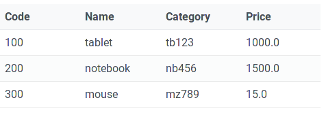
Then point to the View to see the Primefaces datatable in action:
Adding data at runtime
Our next task will be to add new Item objects at runtime. To keep it as simple as possible, we will just add a button in the Form which adds a new Item with random data:
 <p:dataTable var="item" value="#{dtBasicView.items}" id="mydata" size="small" stripedRows="true">
    <p:column headerText="Code">
        <h:outputText value="#{item.id}" />
    </p:column>

    <p:column headerText="Name">
        <h:outputText value="#{item.name}" />
    </p:column>

    <p:column headerText="Category">
        <h:outputText value="#{item.category}" />
    </p:column>

    <p:column headerText="Quantity">
        <h:outputText value="#{item.price}" />
    </p:column>
</p:dataTable>

<p:commandButton  action="#{dtBasicView.addRandom}" update="mydata" value="Add Random" icon="ui-icon-check" style="margin:0"/>
Within the commandButton, we have set to update the component id “mydata” which is the datatable.
The ItemView method “addRandom” wraps the Session Bean:
public void addRandom() {
        service.addRandomItem();
}
The ItemService inserts an Item with random data on the DB:
public void addRandomItem() {
    Item item = new Item();
    item.setCategory(UUID.randomUUID().toString());
    item.setName(UUID.randomUUID().toString());
    item.setPrice(Math.random() * 1000 + 1);
    items.add(item);
    em.persist(item);

}
Editing Data
Another key feature of Primefaces datatable is the ability to edit and update the Cells of a Row.
To be able to edit data we need some changes in the dataTable and add a new server method to update the Row. Here is the edit.xhtml page:
<h:form id="form">
    <p:growl id="msgs" showDetail="true"/>
    <div class="card">
        <p:dataTable var="item" value="#{dtBasicView.items}"  editable="true" size="small" stripedRows="true">
            <p:ajax event="rowEdit" listener="#{dtBasicView.onRowEdit}" update=":form:msgs"/>
            <p:ajax event="rowEditCancel" listener="#{dtBasicView.onRowCancel}" update=":form:msgs"/>
            <p:column headerText="Code">
                <h:outputText value="#{item.id}" />
            </p:column>
            <p:column headerText="Name">
                <p:cellEditor>
                    <f:facet name="output">
                        <h:outputText value="#{item.name}"/>
                    </f:facet>
                    <f:facet name="input">
                        <p:inputText label="Name" value="#{item.name}" style="width:100%"/>
                    </f:facet>
                </p:cellEditor>
            </p:column>
            <p:column headerText="Category">
                <p:cellEditor>
                    <f:facet name="output">
                        <h:outputText value="#{item.category}"/>
                    </f:facet>
                    <f:facet name="input">
                        <p:inputText label="Category" value="#{item.category}" style="width:100%"/>
                    </f:facet>
                </p:cellEditor>
            </p:column>
            <p:column headerText="Quantity">
                <p:cellEditor>
                    <f:facet name="output">
                        <h:outputText value="#{item.price}"/>
                    </f:facet>
                    <f:facet name="input">
                        <p:inputText label="Price" value="#{item.price}" style="width:100%"/>
                    </f:facet>
                </p:cellEditor>
            </p:column>
            <p:column style="width:6rem">
                <p:rowEditor editTitle="Edit Row" cancelTitle="Cancel Edit" saveTitle="Save Row"/>
            </p:column>
        </p:dataTable>
    </div>
</h:form>
Don’t be scared if it looks bigger than our first example. As a matter of fact, we had to wrap – for each editable column- a p:cellEditor element. The cellEditor element contains a facet to output the field and a facet for collecting input, when we are editing.
We also added two ajax elements in order to capture events such as start edit and cancel edit.
Here are both methods, contained in the ItemView Bean:
public void onRowEdit(RowEditEvent<Item> event) {
    FacesMessage msg = new FacesMessage("Product Edited", String.valueOf(event.getObject().getName()));
    FacesContext.getCurrentInstance().addMessage(null, msg);
    service.save(event.getObject());
}

public void onRowCancel(RowEditEvent<Item> event) {
    FacesMessage msg = new FacesMessage("Edit Cancelled", String.valueOf(event.getObject().getName()));
    FacesContext.getCurrentInstance().addMessage(null, msg);
}
To update the DB with your change, we also have added a save method in our ItemService class:
public void save(Item item) {
    Integer id = item.getId();
    Item itemdb = em.find(Item.class, id);
    itemdb.setCategory(item.getCategory());
    itemdb.setName(item.getName());
    itemdb.setPrice(item.getPrice());
    em.persist(itemdb);

}
Let’s test the datatable in edit mode:
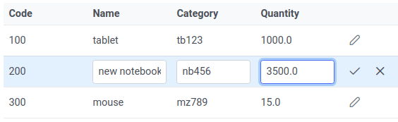
As you can see, all fields (except the Code which is a Primary Key in the DB) can be edited.
Using a Datatable with a Paginator
In most cases, you will have a large set of data to display. For this reason, it is advised to use a Paginator which breaks your data in a configurable set of pages. That’s not at all complicated. Let’s see how to do it:
<p:dataTable var="item" value="#{dtBasicView.items}" size="small" stripedRows="true" rows="10" id="mydata"
             paginator="true"
             paginatorTemplate="{CurrentPageReport} {FirstPageLink} {PreviousPageLink} {PageLinks} {NextPageLink} {LastPageLink} {RowsPerPageDropdown}"
             currentPageReportTemplate="{startRecord}-{endRecord} of {totalRecords} records"
             rowsPerPageTemplate="5,10,{ShowAll|'All'}">
To activate a Paginator you need to set the attribute “paginator” to “true”. Also, you can provide a Template for it (which maps to the Paginator buttons) and the number of Rows to show, which is controlled by the rowsPerPageTemplate field.
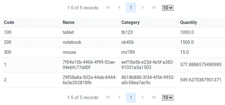
With the above configuration, the view will look like that:
Configuring Datatable expansion
The next example we will include, allows to expand the view showing some extra fields. For example, in the Datatable row you might show only some key fields. By clicking on the single row you can expand it to show some accessory fields. Let’s see how to do it.
<p:dataTable var="item" value="#{dtBasicView.items}" size="small" stripedRows="true">
    <f:facet name="header">
        Expand rows to see detailed information
    </f:facet>
    <p:column style="width:2rem">
        <p:rowToggler/>
    </p:column>

    <p:column headerText="Code">
        <h:outputText value="#{item.id}" />
    </p:column>

    <p:column headerText="Name">
        <h:outputText value="#{item.name}" />
    </p:column>

    <p:column headerText="Category">
        <h:outputText value="#{item.category}" />
    </p:column>

    <p:rowExpansion>
        <h:panelGrid id="display" columns="2" cellpadding="4"
            style="width:300px;" styleClass="ui-widget-content"
            columnClasses="label, value">

            <h:outputText value="Item name:" />
            <h:outputText id="extra" value="#{item.name}" />

            <h:outputText value="Price:" />
            <h:outputText id="date" value="#{item.price}" />

        </h:panelGrid>

    </p:rowExpansion>

</p:dataTable>
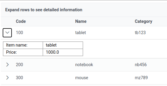
So, our datatable includes an extra column with a RowToggler, which hides the expanded row. Then, we have added a rowExpansion element which shows a Panel with some extra data. In our case, we will show the Price of the Item.
Here is it in action:
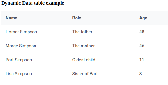
Dynamic Primefaces datatable
A common need for many applications is to create tabular data with a dynamic number of columns. Columns can be added programmaticaly, thus you can use the same dataTable for displaying different kind of models.
Creating a dynamic datatable with PrimeFaces is really easy: instead of using the standard <p:column> tag, use the <p:columns> which references the list of columns (via the value attribute) that are mantained in a Collection.
Here is a simple example:
<html xmlns="http://www.w3.org/1999/xhtml"
    xmlns:h="http://java.sun.com/jsf/html"
    xmlns:f="http://java.sun.com/jsf/core"
    xmlns:p="http://primefaces.org/ui">

<h:head>

</h:head>

<h:body>
    <h:form id="form" prependId="false">

        <h3>Dynamic Data table example</h3>
        <p:dataTable var="data" value="#{tableBean.people}">
            <p:columns value="#{tableBean.columns}" var="column"
                columnIndexVar="colIndex">
                <f:facet name="header">
                #{column.header}
                </f:facet>

            #{data[column.property]}
            </p:columns>
        </p:dataTable>

    </h:form>
</h:body>
</html>
This is the JSF Managed Bean used:
@ManagedBean
public class TableBean implements Serializable {

    private List<ColumnModel> columns;
    private List<People> people;

    private String columnName;

    public TableBean() {
        createDynamicColumns();
        addPeople();
    }

    private void addPeople() {
        people = new ArrayList<People>();

        People w1 = new People("Homer Simpson","The father",48);
        People w2 = new People("Marge Simpson","The mother",46);
        People w3 = new People("Bart Simpson","Oldest child",11);
        People w4 = new People("Lisa Simpson","Sister of Bart",8);

        people.add(w1);
        people.add(w2);
        people.add(w3);
        people.add(w4);
    }

    private void createDynamicColumns() {

        columns = new ArrayList<ColumnModel>();
        columns.add(new ColumnModel("Name", "name"));
        columns.add(new ColumnModel("Role", "role"));
        columns.add(new ColumnModel("Age", "age"));
    }

    public List<People> getPeople() {
        return people;
    }

    public void setPeople(List<People> people) {
        this.people = people;
    }

    public List<ColumnModel> getColumns() {
        return columns;
    }

    public String getColumnName() {
        return columnName;
    }

    public void setColumnName(String columnName) {
        this.columnName = columnName;
    }

    static public class ColumnModel implements Serializable {

        private String header;
        private String property;

        public ColumnModel(String header, String property) {
            this.header = header;
            this.property = property;
        }

        public String getHeader() {
            return header;
        }

        public String getProperty() {
            return property;
        }
    }
}
And this is the datatable, which has been built dynamically on the server side:
Conclusion
Download the example from this tutorial.